
Founding UX Designer · B2B SaaS · MRO
Robot Toolworx: turning an idea into an AI workspace for maintenance teams
Overview
Robot Toolworx is an AI-powered B2B platform for the MRO (maintenance, repair and overhaul) space. It brings parts catalogs, procedures and an AI assistant into one workspace.
I joined as the first designer when the company was 3–4 people. There was no product yet, only an idea of what it could be. My job was to turn that open question into something the team could build, sell and use.
- Role
- Founding UX Designer
- Worked with
- CEO, CTO and sales team
- Scope
- Research, IA, user flows, UI, design system, design QA
Most of this work is under NDA. These are a few screens I can show.
Starting from a blank page
No screens, no flows and no spec. Just a strong belief that people in maintenance, repair and overhaul needed a better way to find the right information and get help in the moment.
That meant the first design problem was not a screen. It was deciding what the product should be, who it was for, and what to build first.
The challenge
One product that works for a technician on site and a lead at a desk.
How I created clarity
Each open question became a concrete artefact the team could react to, build from or pitch with.
What is this product?
Explored the MRO space and ran a competitive analysis, then wrote the specs the software would be built on.
Who is it for?
Mapped user journeys for technicians, product managers and company leads, and where each of them works.
What goes where?
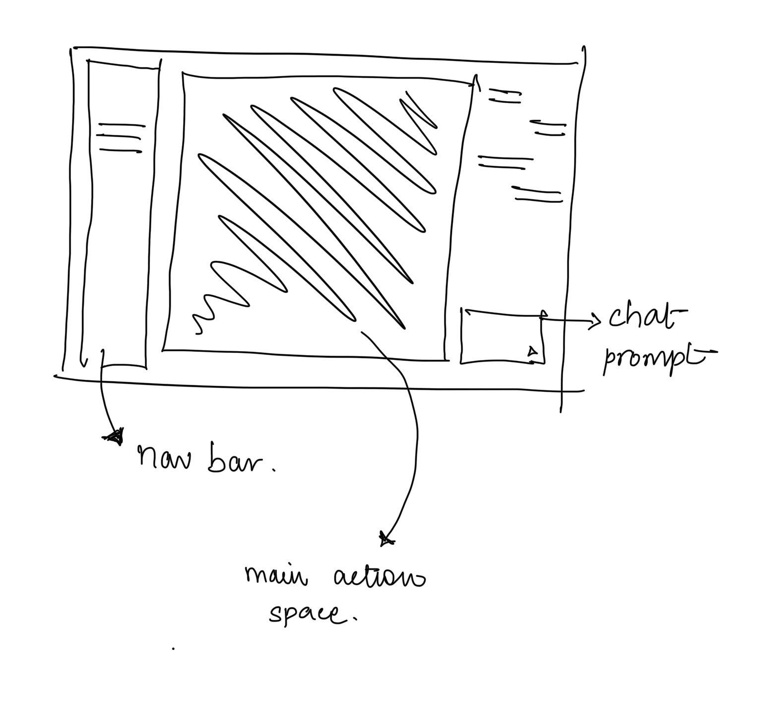
Defined the information architecture and core user flows before designing screens.
How do we stay consistent while moving fast?
Built the design system side by side with the first screens: type, colour, icons and components.
How do we win early customers?
Turned flows into pitch prototypes the CEO and sales team could put in front of clients.
Research
- User journeys: how work moves from the office to the job site and back.
- The MRO space: how maintenance teams find parts information and follow procedures today.
- Competitive analysis: what existing tools do well and where they leave gaps.
- Product specs: turning findings into requirements the CTO could build against.
Who it's for
Need fast answers about parts and procedures while their hands are busy.
Organise catalogs and procedures so the right information reaches the field.
Manage teams, access and the business accounts that use the platform.
Information architecture
Before any visuals, I mapped what lives where. Three areas came out of it: the files people work with, the assistant that helps them, and the controls that decide who sees what.
The workspace
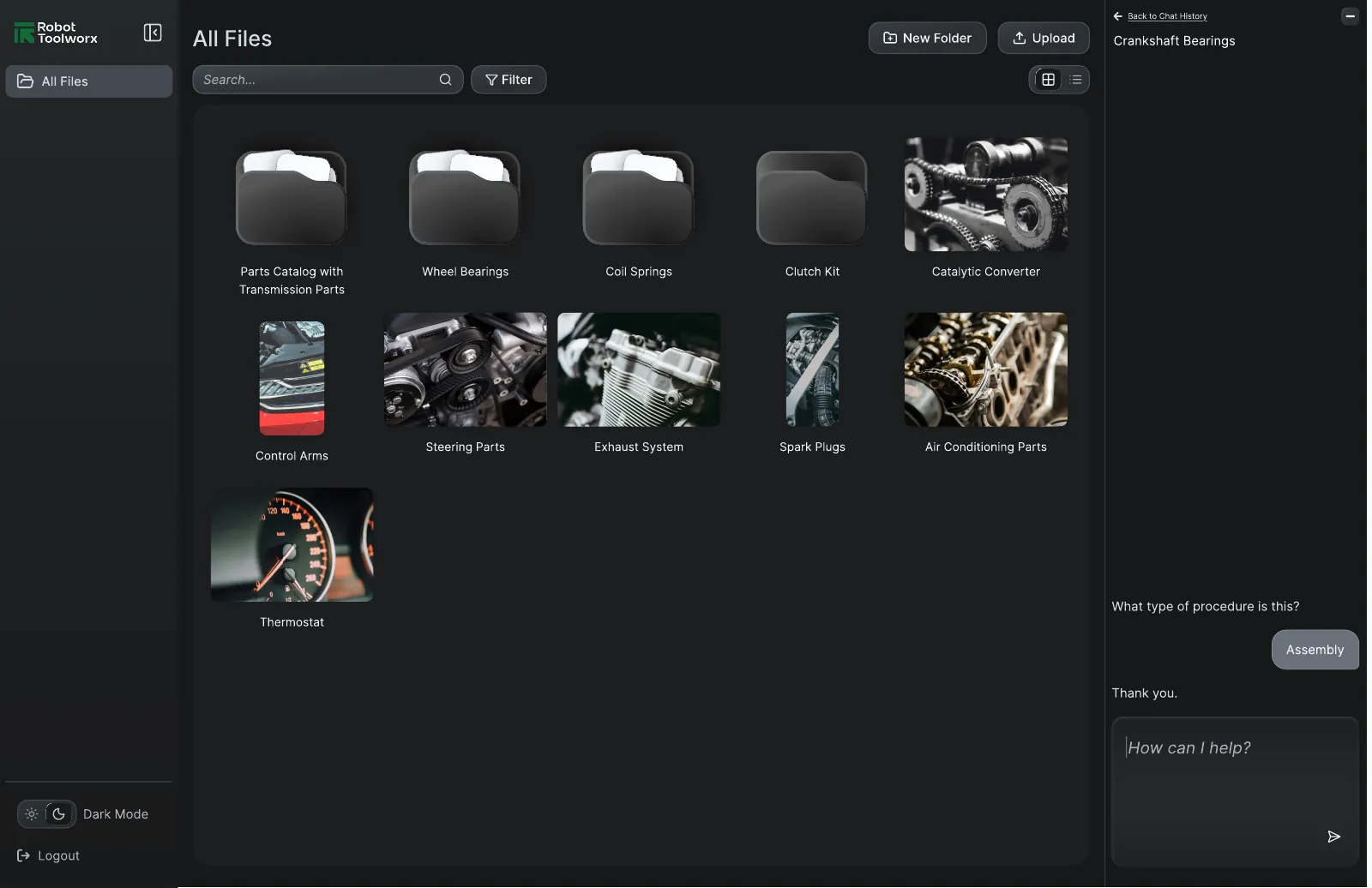
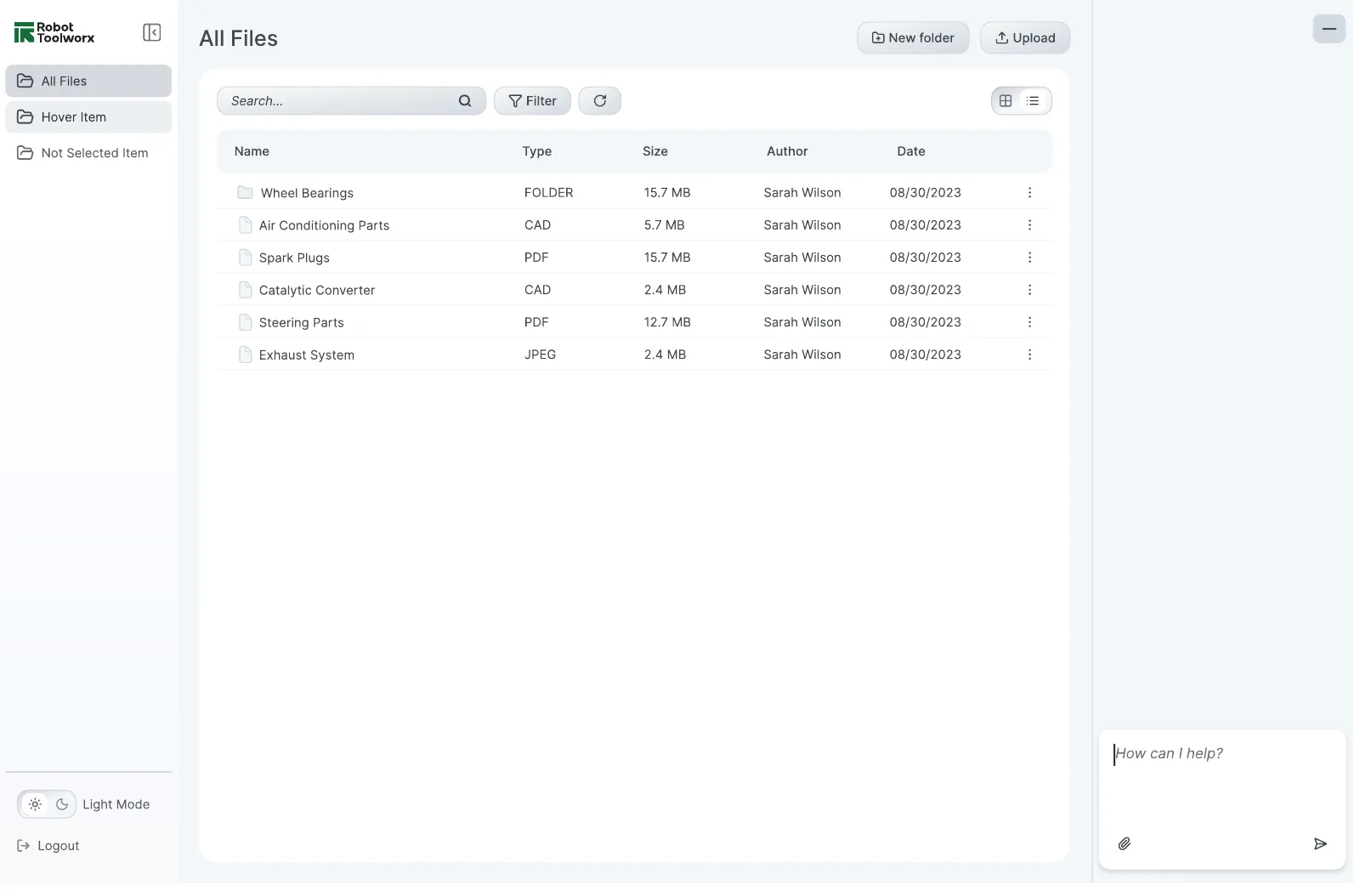
Parts catalogs show up as visual tiles so people recognise them at a glance, with a list view for details like type, size, author and date. The AI assistant sits right next to the files, so asking for help never means leaving your work.
Many conversations, one place
People come back to the same parts again and again, so a single chat wasn't enough. I designed chat history with pinning, so the conversations someone needs most stay on top. Step through the flow:

Deleting is the one action people can't undo, so it asks first and confirms after.

Who sees what
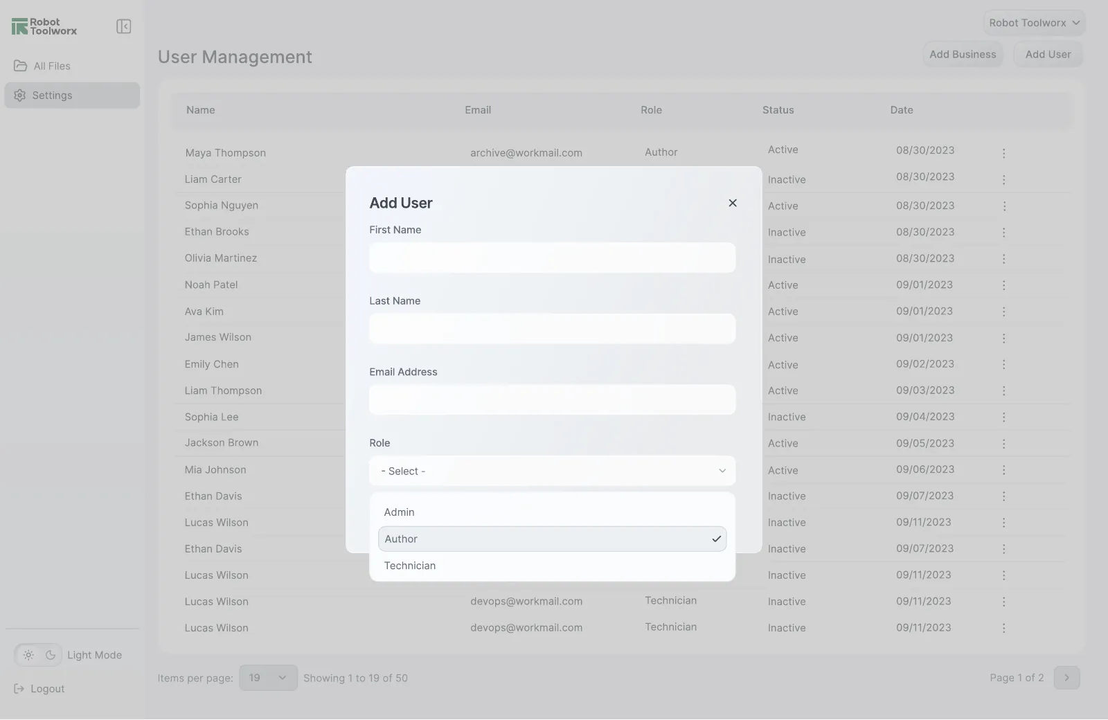
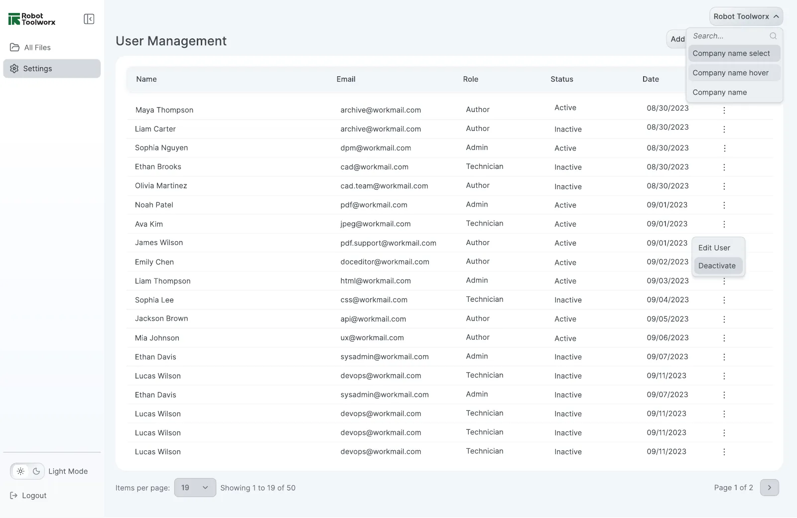
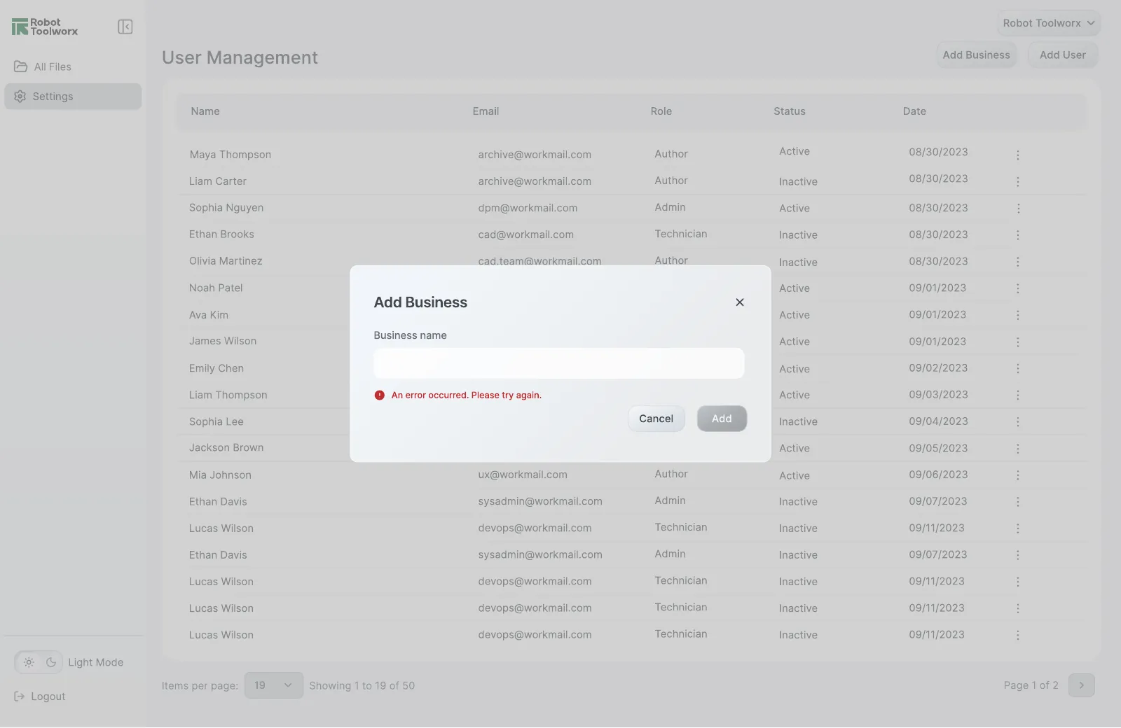
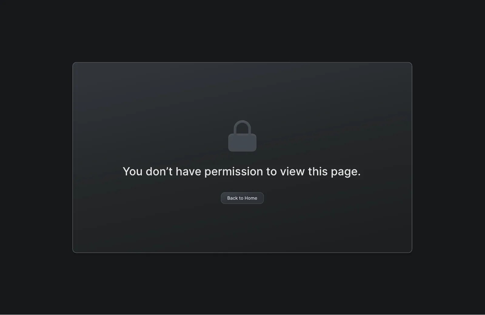
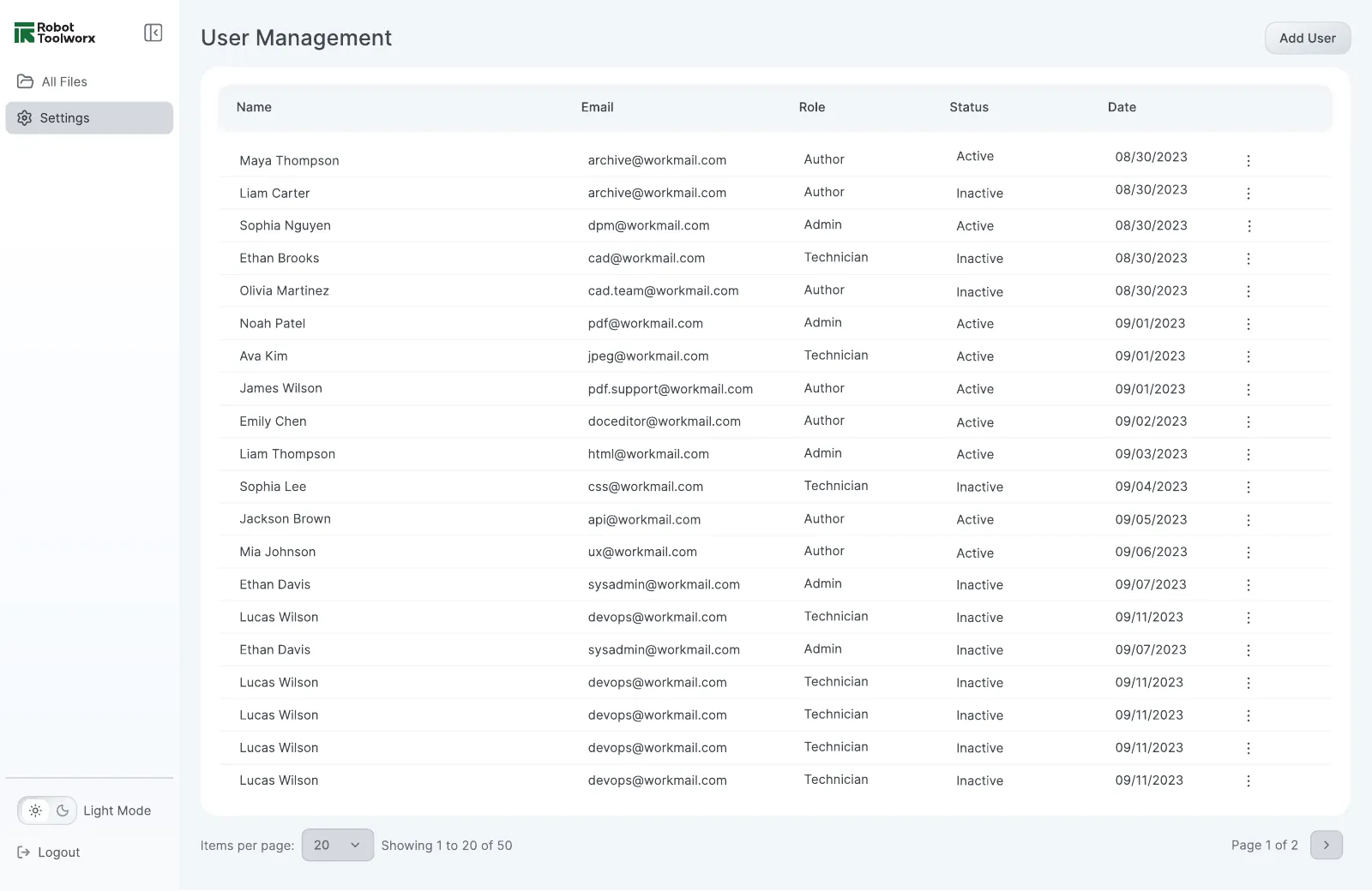
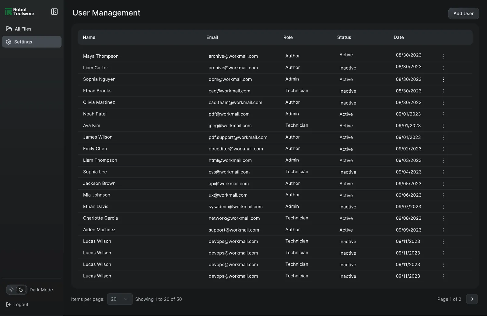
Different people in a company need different powers. I designed role-based user management with four roles, plus a Super Admin view for running several businesses from one account.
A design system built alongside the product
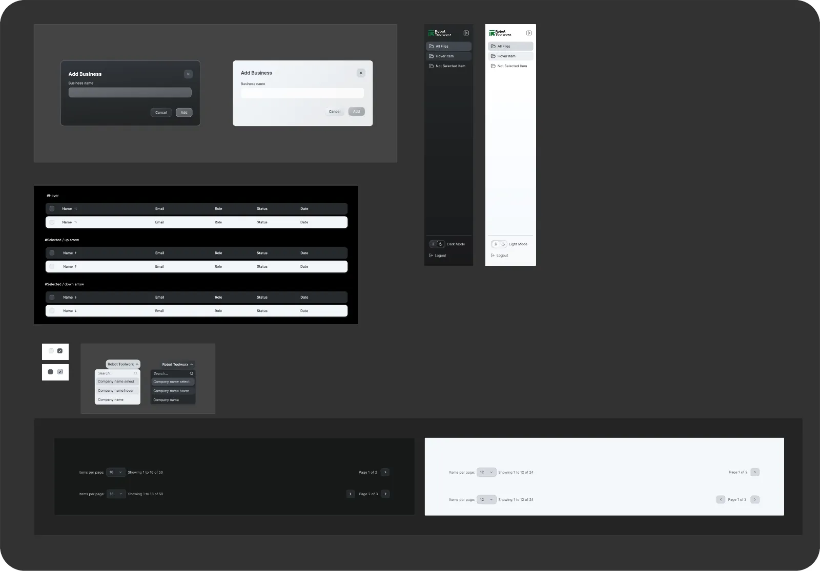
Instead of designing screens first and tidying up later, I built the system as the product grew. Typography, colour, icons and components came first, and every new feature added to the library instead of drifting from it.
- 100+ components, all built from scratch, covering tables, navigation, dialogs, dropdowns, pagination and more.
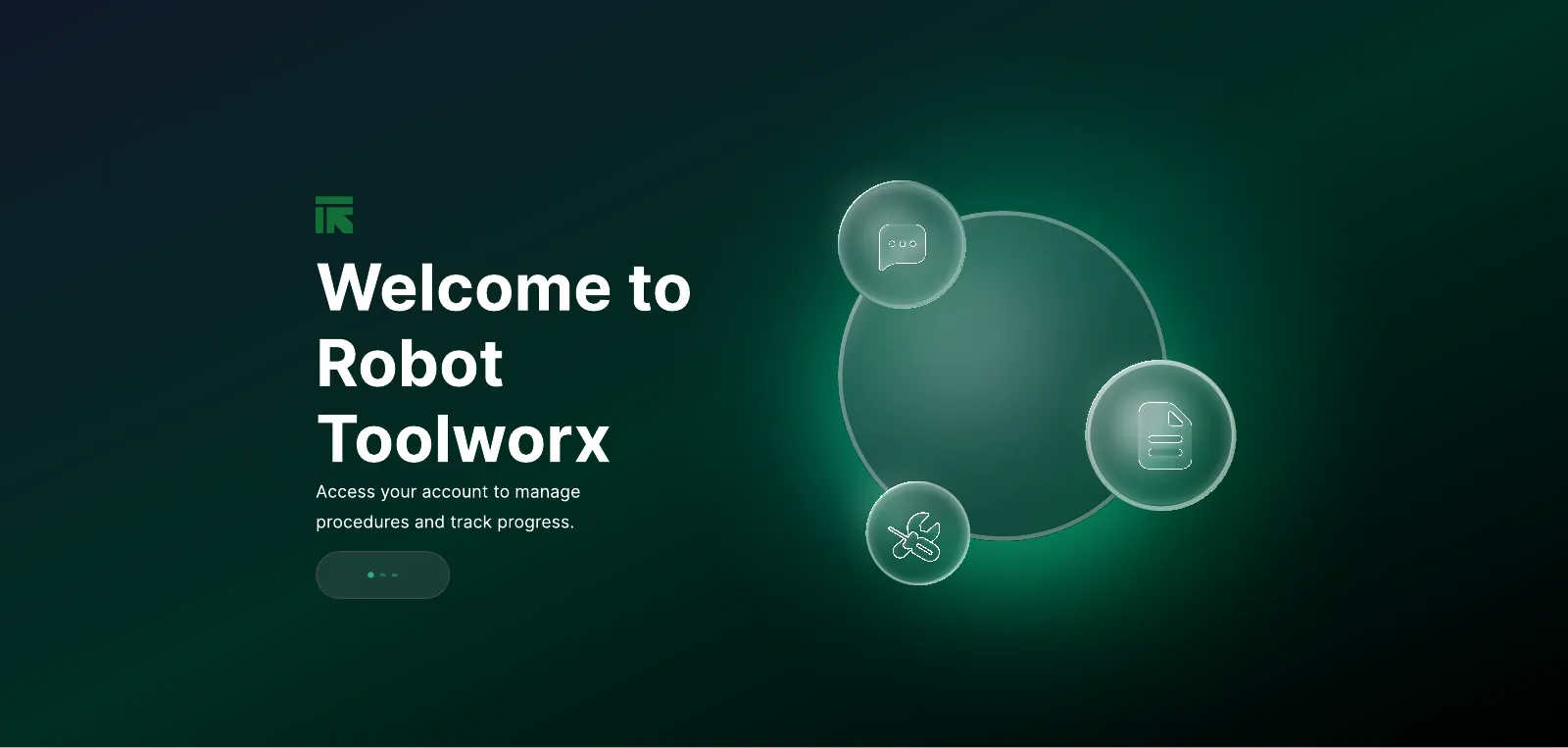
- Original illustrations, including the landing page artwork, all drawn from scratch.
- Lucide icons as the icon set, for clean, consistent line icons across the product.
- Light and dark mode for every screen, since people work in bright offices and on dim job sites.
- Design tokens exported as JSON so engineering could use the same values in code.
Drag to compare light and dark:
Impact
- 60% more user engagement after improving flows through usability testing.
- Clients grew from 4 to 12 in 12 months, helped by the pitch prototypes I designed.
- 30+ issues logged and triaged in Linear through design QA with engineers.
- From idea to product: specs, IA, flows, UI and a design system, all from a blank page.
Learnings
- Make the unknown visible: a rough flow or spec gets better answers than an open question.
- Design for the setting, not just the screen: a technician on site and a lead at a desk need different things from the same product.
- Build the system as you go: designing components with the first screens kept a fast-moving product consistent.
- Prototypes do double duty: working closely with the CEO and sales team meant designs also helped close clients.