Work at Eloomin · Onboarding / Subscriptions / Consumer social app
Eloomin: an onboarding experience that welcomes people in
Overview
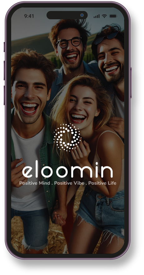
This is work I did at Eloomin as a UX/UI Designer Intern. Eloomin is a social app built around positivity: "Positive Mind. Positive Vibe. Positive Life." New users landed straight on the homepage with no idea what the app was or how to subscribe, so we designed an onboarding flow that tells the Eloomin story, offers a monthly plan and personalises the feed from day one.
- Company
- Eloomin
- Role
- UX/UI Designer Intern
- Team
- 4 UX designers & researchers
- Timeline
- 3-month project, Agile sprints
Background
When users logged in, they were taken directly to the homepage without any context on what the app is about or what features it offers. There was no dedicated subscription page where they could sign up, leaving users unsure of how to get started.
The problem
“New users had no introduction to Eloomin and no clear way to subscribe, so many never got started.”

The solution
We created an onboarding experience to guide users through the app, helping them understand its purpose and features. It is designed to reduce drop-off and boost retention, and lets users easily subscribe to a pay-per-month plan, making the process seamless and clear.
The goal
“Welcome people in, show them why Eloomin is different, and make subscribing feel simple.”
Competitive analysis
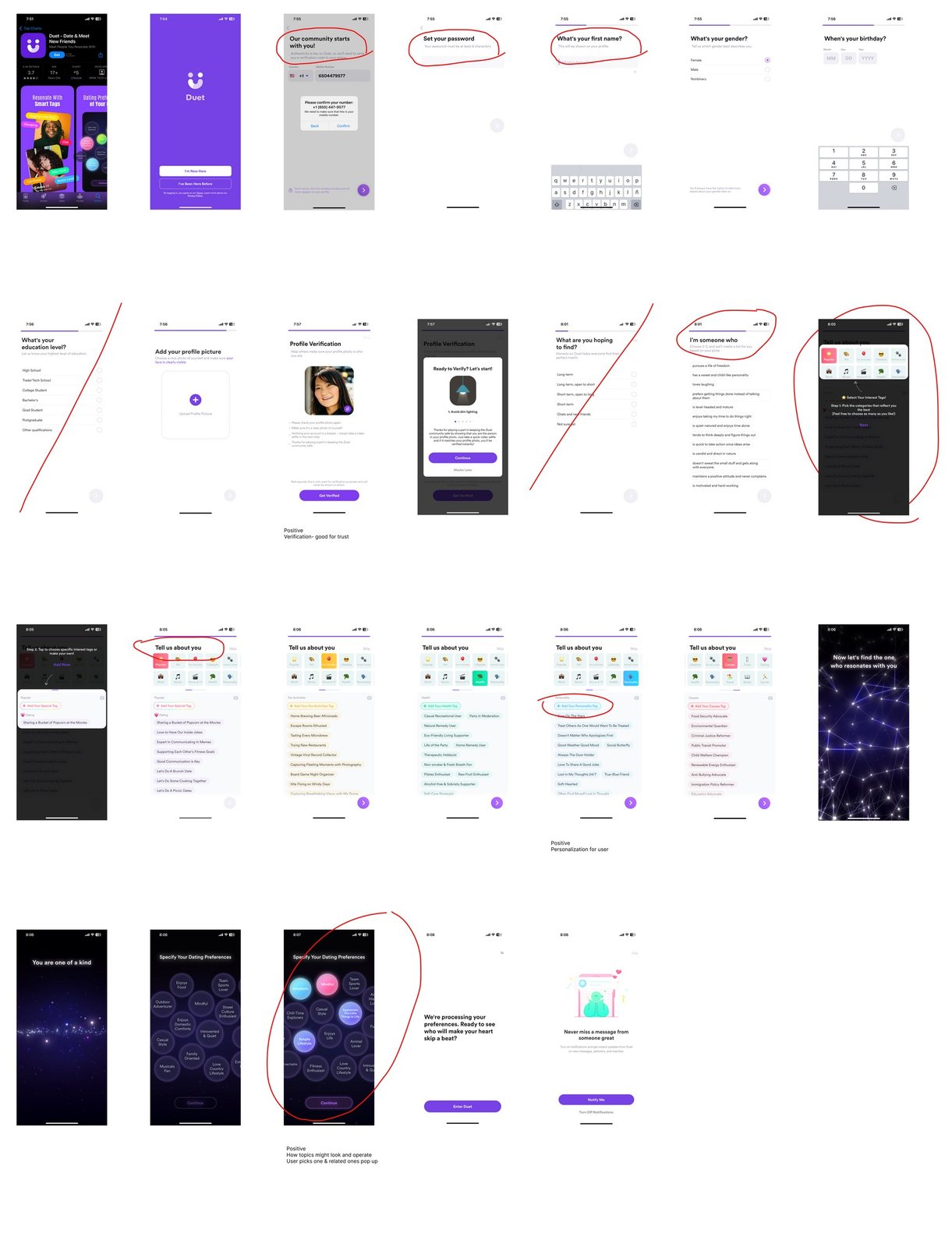
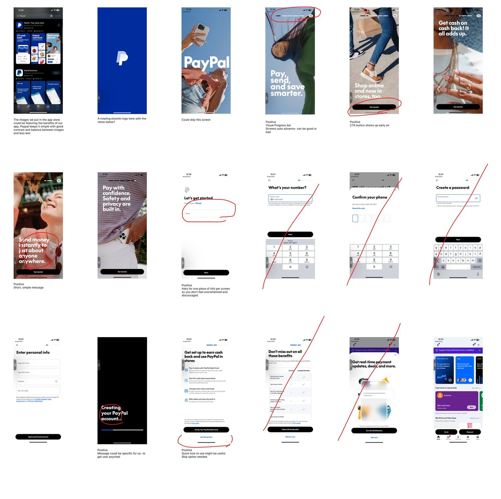
I audited onboarding in apps people already love, including Instagram, PayPal, Duolingo, Perplexity and Duet, marking every screen with what worked and what didn’t.
- Ask for one thing per screen: users don’t feel overwhelmed or discouraged.
- Short, simple messages: each screen says one thing clearly.
- Show the main call to action early: people know how to move forward.
- Personalisation: choosing interests makes the app feel like theirs.
- Verification builds trust: confirming a phone or email feels safe.
Mapping every path
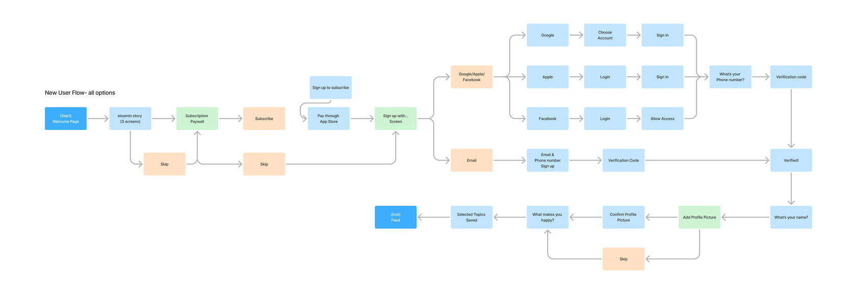
I mapped every route a new user could take: a three-screen Eloomin story, a subscription paywall they can skip, sign-up with Google, Apple, Facebook or email, phone verification, then name, profile picture and “What makes you happy?” topics, ending on a personalised feed.
Hi-fi prototype
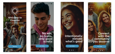
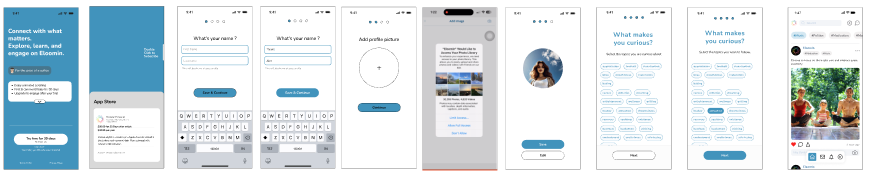
The story screens set the tone with short, warm lines like “No ads, no trolls, only good scrolls”, “Intentionally elevate what’s good” and “Connect with the community you deserve”. Sign-up then asks for one thing at a time, with clear skip options and a topic picker that shapes the first feed.
Learnings
- Borrow proven patterns: auditing familiar apps showed what users already expect from onboarding.
- Respect people’s time: one question per screen and easy skips keep momentum.
- Design every path: mapping all sign-up options early saved rework later.
- Team rhythm: working in Agile sprints with 4 designers and researchers kept feedback fast.
Prototype walkthrough
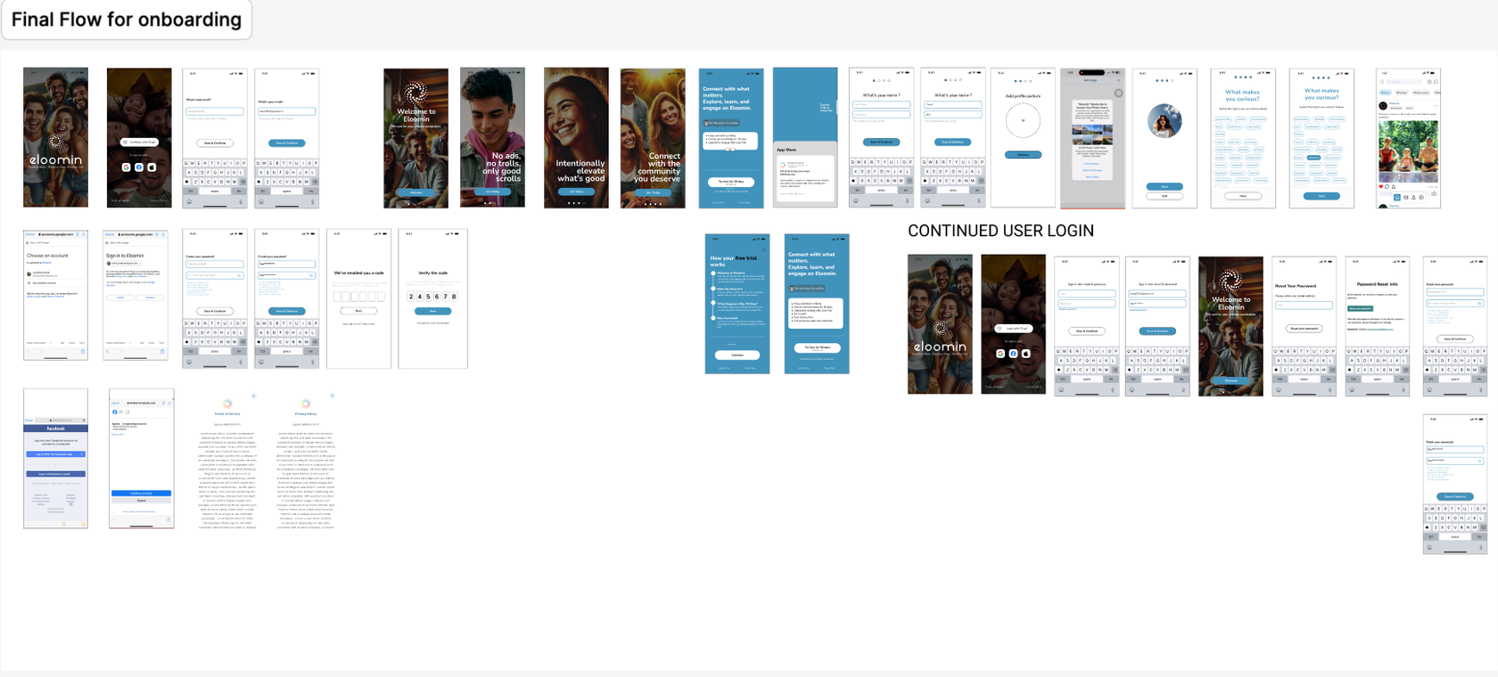
A walkthrough of the final onboarding prototype, from the welcome story to choosing your interests.